As a web developer, you constantly work with text. And you will often make decisions on how this text will look, especially if you work without a designer. Even if you don’t notice those choices, they are still here. And, frankly, some of you make bad choices.
In this guide, we’ll go over key typography settings and learn how we can manipulate them with CSS to make text on your apps and websites look good by default. This tutorial will be useful for developers that want to get 80% of results with 20% of efforts, without diving head first into typography. It might come handy for people who are already good with typography but didn’t work with web closely and want to quickly learn CSS equivalents of familiar concepts.
This article won’t cover choosing a particular typeface for your projects or their classification. It will, however, cover what format your font should be in. Additionally, it won’t cover topics related to the proper choice of quotes or when to use hyphens versus em dashes. But if you’re interested in this kind of stuff, I really recommend Butterick’s Practical Typography.
Instead, we’ll concentrate on general adjustments to make text good-looking and easy to read, and more specifically, what CSS rules you’ll need for that.
Lastly, remember that in design, rules can take you far, but you shouldn’t be afraid to break them. Today I’ll share some rules and recommendations, but that doesn’t mean you can’t do things the other way. If you’re confident about your choice – please, break the rule! But if you’re not sure – stick to sensible defaults.
Table of contents
- Choose font
- Size and spacing
- Establish hierarchy
- Choose colors
- Text wrapping
- Browser quirks
- Further reading
Choose font
Consider local fonts
When it comes to fonts on web pages, you can select either from the fonts the user has installed on their device, or you can load custom fonts. For projects without many requirements for typography, I recommend using built-in fonts. And that doesn’t mean Arial and Times New Roman! You might be surprised at how far system-ui can take you. And for even more choices, check out Modern font stacks.
This text is set using font-family: system-ui. It will look a bit different depending on your system, but it will look decent nevertheless. Here is a bit of lorem ipsum for you to make this block a bit bigger.
Lorem ipsum dolor sit amet, consectetur adipiscing elit, sed do eiusmod tempor incididunt ut labore et dolore magna aliqua. Ut enim ad minim veniam, quis nostrud exercitation ullamco laboris nisi ut aliquip ex ea commodo consequat.
Using a local font makes your website load faster and removes flash of unstyled text completely, at the cost of customizability. So while this won’t work for all projects, I still encourage you to give it a try.
External fonts
To load custom fonts, you’ll need to host your font and add a @font-face rule to your styles.
There are services that host fonts for you, the most popular (and free) of which is Google Fonts. If you’re using a proprietary font, a distributor/foundry might host it for you as well.
Format for external fonts
Historically, fonts were distributed in different formats. Most popular are TrueType (.ttf) and OpenType (.otf), both of which you can use as external fonts, but that doesn’t make much sense unless you want to support ancient browsers. For modern browsers, WOFF2 is a better choice. Browsers can load fonts in a bunch of different formats, but we care only about modern browsers, and all of them work well with WOFF2.
WOFF fonts share a lot with TrueType and OpenType, but they are compressed, and font developers are more willing to license fonts for use in web apps in .woff format rather than .ttf or .otf. You can convert fonts to WOFF2 (and back) using woff2 tools from Google (or using this brew formula if you’re on Mac).
Prefer variable fonts
Some time ago, if you wanted to use a different weight for text (e.g., bold), you had to load multiple font files (same for italic).
/* This definition only loads font file with weight 400 and normal style */
@font-face {
  font-family: 'Sonko';
  src: url('path/to/sonko-regular.woff2') format('woff2');
  font-weight: normal;
  font-style: normal;
  font-display: swap;
}

/* If you want different weight or italic, you need to load multiple files here */
As you can guess, managing 120 lines of CSS just to load fonts isn’t exactly the best thing to happen to a developer. Services like Google Font will do this for you, but still, downloading multiple files will affect the loading time of your website.
Fortunately for us, there are variable fonts to help. Variable fonts can be adjusted by changing the value of one of their axes. This might change the font’s width, slant, optical size and so on. But most of the time, we’re interested in the weight (wght) axis. It allows us to granularly set the font’s weight, for example, to 582, while with traditional fonts, you’d have to choose between 500 and 600.
Besides having more control over the font’s look, they are also superior in terms of file size. Usually, a variable font file is bigger than a file with one static weight but smaller than the sum of the sizes of two files with static weight. So if you use more than one font weight on your website (and you probably do), prefer using variable fonts to save users a couple hundred of kilobytes to download and make your site load faster.
@font-face {
    font-family: 'MyFont';
    /* Acceptable weight range */
    font-weight: 100 900;
    font-style: normal;
    font-display: swap;
    src: url(/fonts/MyFont.woff2) format('woff2-variations');
}
Subsetting
Some typefaces support a lot of writing systems, which means there are a lot of glyphs packed inside. And it’s quite possible you don’t need them all. If you know that your content will be in English only, there is no point in having users load parts of the font that contain Cyrillic, Greek, or Arabic glyphs.
To optimize loading times for such cases, you can use subsetting. It’s a technique when you create a new font based on the original, but remove all unused glyphs. This will make the font file smaller, which might make a big difference on loading times.
Size and spacing
Font size
A font should be big enough to read comfortably. The default font size in all browsers is 16px, which will work well for most cases. If your chosen font looks too big or too small at this size, adjust the font size on root using percentages:
:root {
    font-size: 112.5%; /* = 18px */
}
By the whim of the typographic gods, different fonts of the same size can look very differently, so if you change your font, you’ll need to adjust the sizing as well. Learn more here.
Use rems to set the font size for other elements:
.alert {
    font-size: 1.25rem; /* = 20px */
}

.tip {
    font-size: 0.875rem; /* = 14px */
}
Some users change the default font size in browser (for example, users with visual impairment). If you set your font sizes in absolute units (e.g. 16px), the browser will respect that rule and will render text at 16px, even if the user set the default font size to 18px or 20px. We should respect user choice, and so we use percents (which will be based on default font size) to set font size on root, and rems (based on root font size) for other elements.
There are no fixed rules regarding the font size of particular elements, like headings. But as a good starting point, I like to use typographic scale, it helps calculate the font size for different elements based on a fixed ratio. On typescale.com you can experiment with different ratios and see how they look in the context of a landing page or blog post.
Line height or leading
This is one of the easiest wins you can get in typography. Setting the proper line height might have a tremendous impact on the overall look. If text is packed too tightly, it’s harder to follow the line, which reduces readability. And if the line height is too big, it makes it harder to go from the current line to the next one and breaks the visual rhythm.
In CSS, line height can be set in absolute units (e.g., 24px) or relative to the font size of the current element. I’m yet to find a good use case for absolute line height (if you know one, drop me a message!), so I’d recommend to use relative values.
:root {
    line-height: 1.5; /* 1.5 × font-size */

    /*
    It's also possible to use percents, but it's
    not recommended due to poor inheritance behavior
    */
    line-height: 150%;
}
Default values for line height in browsers are between 1.1 and 1.2, which is just too small for big bodies of text. Your ideal value will vary depending on the typeface you’re using, but 1.5 is a good starting point.
By the way, this website has line-height set to 1.5. It works well for the selected font (Work Sans) and makes the text easy to read, which is critical for long blog posts.
And here is an example of a text using 1.15 line height. It’s still readable, especially for short paragraphs. But it makes the text look very packed, which doesn’t work well for longer paragraphs. The default line height will vary depending on your browser, the device you’re using it on, and other parameters, but generally it’s something between 1.1 and 1.2, which is not enough.
And for contrast, here is a paragraph with line-height set to 1.9. It’s a bit too much, isn’t it? Text lines look disconnected from each other, it’s harder to follow from one line to the next, especially if lines are quite long. And even though on the web we have unlimited canvas, unlike people who do typography for printed mediums, it feels a bit like wasted space…
This recommendation applies to body text, i.e., text with font size around 16px, give or take. For bigger text, like headings, you don’t need as much leading. It, again, depends on the font you use, and the looks you want, but something between 1.15 and 1.3 usually works well.
If you want to dive deeper and know why line height behaves differently between fonts, here are a couple of articles for you: one, two.
Limit line width
Long lines are hard to read, don’t do long lines. This is usually not an issue on mobile devices, but for folks with wide monitors, reading your site might be a really miserable experience if you don’t limit line width.
Research on optimal line width isn’t as clear and certain as we’d like, but a length between 45 and 100 characters is considered optimal. For instance, the average line length on this site is 90 characters.
There isn’t a way to explicitly set a line length limit in CSS, so instead you need to limit the size of the text’s container.
main {
    max-width: 800px;
}
Play with tracking
This one is a bit tricky. Tracking is a space between letters. If you’re using a well-made typeface, chances are high it already has the best tracking baked in. If you’re unsure whether you need to adjust tracking, you probably don’t. But sometimes you’ll need to make manual changes for very small texts to make them more readable, or for very big texts to make them more compact.
Tracking is set using letter-spacing property, usually in ems, a relative unit which corresponds to font size of the current element.
.small-tip {
    letter-spacing: 0.02em;
}
This is an <h2> title with default tracking
This is an <h2> title with -0.02em tracking
Establish hierarchy
Clear hierarchy defines what is important on the page. It helps the user better understand the order of importance of the content on the page. When titles, subtitles and body text have clear hierarchy, it gives the document a clear structure which helps users navigate it faster.
This is often done with font size: titles will be big and body text will be (relatively) small. But this is not a rule. Similarly, you can build hierarchy using color and weight. Take a look onto Emil Kowalski website:
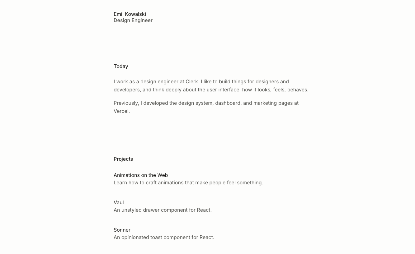
All text there has the same size, instead Emil uses a slightly bolder font for the headings and a slightly pale gray color for body text. This creates a clear hierarchy with enough contrast between elements.
Choose colors
For body text, it will be a good idea to pick a neutral color to not put a strain on the reader’s eyes. Usually it’s some kind of light gray for pages with dark backgrounds and dark gray text color for pages with light background. Traditional pure black on white (and vice versa) might look too contrasting on some screens.
Interface elements, like buttons, tend to be more colorful. It’s important to ensure that the text on them has a sufficient contrast ratio. It should be at least 4.5 for small and normal text and at least 3:1 for large and bold text. You can check contrast directly in Chrome DevTools or using apps like this one.
Text wrapping
In typography, a single word wrapped to the next line is called an orphan, and it looks a bit messy, especially in titles. Fortunately for us, there is a text-wrap: balance property that fixes exactly that.
h1, h2, h3, h4, h5, h6 {
    text-wrap: balance;
}
With this property, the browser will use a different algorithm to wrap multiline text – it will try to balance the lines so they all have similar lengths. This helps to avoid orphans and makes titles look more tidy. One downside, though. This will work only for small blocks of text (6 lines max for Chrome and 10 for Firefox), so its usage is limited to titles and short blocks of text like alerts or tooltips. Here is an excellent article on this topic.
Chrome supports text-wrap: pretty, which achieves similar results and works for bigger blocks of text. However, it’s not yet supported by Firefox and Safari.
Browser quirks
Font size on mobile
Mobile browsers (often it’s Safari on iOS) might automatically make the font size bigger in some cases (learn more). Usually, this isn’t desired, so disable it using the text-size-adjust property.
:root {
    -moz-text-size-adjust: 100%;
    -webkit-text-size-adjust: 100%;
    text-size-adjust: 100%;
}
If you need to adjust the font size on mobile, use media queries for this.
Font smoothing on macOS
CSS allows you to choose how fonts are rendered on macOS. You can do this with -webkit-font-smoothing and -moz-osx-font-smoothing properties. By default, the browser will automatically pick what it thinks is best, which is usually subpixel-antialiased. However, you can manually set it to antialiased/grayscale, which (subjectively) makes text look better.
This is a somewhat debatable topic. For example, this really popular article describes why you shouldn’t do it. But at the same time, antialiasing is enabled on ~60% of websites, and it’s included in default Vite starters.
In my experience, this setting makes rendered text look better, more crisp, if you will.
:root {
    -webkit-font-smoothing: antialiased;
    -moz-osx-font-smoothing: grayscale;
}
I’d decide on a case-by-case basis whether to use font smoothing or not. If you have a Mac, check if your site looks better with antialiasing (or ask a friend with a Mac). This website also sets this property, as it makes quite a difference, especially for the font used for headings.
This is heading
If you’re reading this on a Mac, you’ll see the difference between these two paragraphs. This paragraph has -webkit-font-smoothing: antialiased, while the other one has it set to auto. For other browsers and platforms, they will look the same.
This is heading
Lorem ipsum dolor sit amet, consectetur adipiscing elit, sed do eiusmod tempor incididunt ut labore et dolore magna aliqua. Ut enim ad minim veniam, quis nostrud exercitation ullamco laboris nisi ut aliquip ex ea commodo consequat. Duis aute irure dolor in reprehenderit in voluptate velit esse cillum dolore eu fugiat nulla pariatur.
Further reading
If typography is something that interests you, here is a great resource to learn more. Previously mentioned Butterick’s Practical Typography is also one of my favorite books on the topic. If you want to dive into making your own fonts, Type Design Resources is the biggest collection of information on this topic that I know.
If you read until here, I’m confident that you agree on how important typography is. And I hope this article helped you better understand what makes good typography. But unfortunately, it won’t help you make great typography, that’s something that comes with a lot of trial and error. So go and do some typesetting!