
In the previous article (Quick guide to web typography for developers) we covered the basic steps to improve the typography in your apps. Today I’d like to expand a bit more on the topic of fonts and what you can get out of a high-quality font (paid or free). High-quality fonts often come with a full bag of goodies, it will be unwise to not use what the type designer gifted (or sold) to us.
The minimal package you would expect from a font includes different weights and maybe italic. Traditionally, it was made by creating a separate font file. One for Helvetica Regular, one for Helvetica Bold, and separate files for Helvetica Regular Italic and Helvetica Bold Italic. But with OpenType features, we can pack all those fonts into one file, along with a bunch of other goodies. We’ll cover some of the most interesting features, but there are more.
Available features will vary from font to font, to check what is included with your font, use Wakamai Fondue.
Table of contents
- Variable axes
- Alternates
- Stylistic alternates
- Swashes
- Numerals
- Small caps
- Contextual alternates
- Further reading
Variable axes
OpenType fonts can have one or more axes, and by changing their value, we can change the font’s appearance. Axes names (and other OpenType features) consist of 4 characters, and the most popular one is wght which controls the font’s weight.
There are a couple of other common axes: wdth for width, slnt for slant, ital for italic, and opsz for optical size. But in addition to standard axes, the type designer can create custom axes, which further extends the creative potential of the typeface.
There are two ways to manipulate variable font axes. An axis might have its own CSS property, like font-weight which translates into wght axis. For other axes, including custom ones, you will need to use font-variation-settings property.
.cls1 {
    font-weight: 451; /* wght axis */
    font-stretch: condensed;  /* wdth axis */
    font-style: italic; /* ital axis */
    font-style: oblique 40deg; /* slnt axis */
    font-optical-sizing: none; /* opsz axis */
}

.cls2 {
    font-variation-settings: 'MONO' 0.25;
}
When possible, you should prefer to use specific properties provided by CSS rather than using font-variation-settings for everything. A major problem with font-variation-settings is that it doesn’t play well with cascading, as defining this property on an element completely overwrites values inherited from the parent element.
Imagine a situation: you have a paragraph of text for which you want to set a specific width, and it contains an element to which you also want to apply a specific slant. Normally, you should use font-stretch and font-style, but for the sake of example, let’s assume you need to use font-variation-settings. You might try something like this:
p {
    font-variation-settings: 'wdth' 75;
}

.emphasis {
    font-variation-settings: 'slnt' -5;
}
The emphasis element will have the correct slant; however, its width will be reset to the default one. The correct way to set variation settings for the element would be to define values for both axes explicitly.
.emphasis {
    font-variation-settings: 'wdth' 75, 'slnt' -5;
}
To work around this, we can use CSS variables.
:root {
    --wdth: 100;
    --slnt: 0;
}

* {
    font-variation-settings: 'wdth' var(--wdth), 'slnt' var(--slnt);
}

p {
    --wdth: 75;
}

.emphasis {
    --slnt: -5;
}
On this website you can play with a lot of different variable fonts, some of them have very interesting and unusual axes.
Besides axes, there are pre-defined OpenType features that can be turned on or off (and sometimes they also allow you to select one of the pre-defined values). Let’s talk about the most popular ones.
Alternates
Fonts can contain alternative glyphs for certain characters. This includes different styles of numbers, swashes, ligatures, and just an alternative style for certain characters. But what exactly is available will vary from font to font.
Stylistic alternates
Starting with stylistic alternates. Those are just alternative forms of letters that you can enable. In some fonts, it might change how “I”, “l”, and “1” look to disambiguate them, in other fonts, it just replaces single-story “a” and “g” with double-story alternates. There are 3 different OpenType features related to stylistic alternates that somewhat overlap.
Firstly, there is salt to enable stylistic alternates for all letters. It’s this one setting that will likely alter how “a” and “g” look.
Then there are stylistic sets. They are named ss01, ss02, and so on. They replace only a subset of characters with alternates. Sets might have a certain purpose beyond just changing visual appearance, for example, typeface Inter has the stylistic set “Disambiguation” which changes the appearance of characters that might look too similar to other ones, like “I” and “l” or “0” and “O”.
Finally, there are character variants (cv01, cv02, and so on) that replace just a single character.
There are two ways to use alternates on the web. You can enable OpenType features directly, similar to how we directly manipulate axes:
h1, h2, h3 {
    font-feature-settings: 'salt' on, 'ss01' on, 'cv06' on;
}
This is very similar to font-variation-settings and has the same downside with inheritance. Another (newer) option is to use the “native” CSS property font-variant-alternates. To use it, we first need to map user-defined values to values that will be passed to the OpenType font:
/* This is set per font */
@font-feature-values "Work Sans" {
    /* salt feature */
    @stylistic {
        /*
        'on' is the value which we'll use in styles, while
        1 is what will be passed to OpenType font.
         */
        on: 1;
        off: 0;
    }

    /* ss01, ss02, ... */
    @styleset {
        /*
        alt-digits is the name for the set we'll use in styles,
        while 1 is its number (translates to ss01)
        */
        alt-digits: 1;
        disambiguation: 2;
    }

    /* cv01, cv02, ... */
    @character-variant {
        /*
        This notation is a bit different: here, simplified-u will be used
        in styles, but 6 means that it should enable sixth character
        variant, OpenType feature cv06
        */
        simplified-u: 6;
        compact-f: 12
    }
}

h1, h2, h3 {
    font-variant-alternates: stylistic(on) styleset(alt-digits) character-variant(compact-f);
}
And while it’s definitely more readable, this approach has the same problem with cascading, as defining font-variant-alternates on an element will overwrite the parent value instead of extending it, so in any case, you’ll need to do tricks with CSS variables to work around this issue.
Swashes
Some fonts come with swashes, which can be used to add a bit of character to titles. Similar to stylistic alternates, there are two ways to enable swashes:
h1, h2, h3 {
    font-feature-settings: 'swsh' on;
}
@font-feature-values "Work Sans" {
@swash {
on: 1;
off: 0;
}
}
h1, h2, h3 {
font-variant-alternates: swash(on);
}Work Sans Regular
Work Sans Regular
Numerals
One font can have different sets of glyphs for numbers. Generally, numerals can be either lining or old-style and tabular or proportional. Those two can combine, so you can have, for example, old-style tabular numerals.
Tabular numerals all have the same width. Like a monospaced font, but only for numerals. Since such numerals line up when typed on multiple lines, they’re useful in, well, tabular data: tables, bills, reports, you name it. Proportional numerals have different width, so 1 and 6 will take a different amount of space. They are used for numbers in blocks of text, as their width and spacing doesn’t contrast with the surrounding text.
Lining numerals are aligned by baseline at the bottom, and they all have the same height, usually the same as a capital letter. Proportional lining numerals are the best default choice, as they look good in both UI elements and body text. However, due to their size and alignment, some designers prefer not to use lining numerals for body text, as they think such numerals look like capital letters at a glance, and multiple capitals together draw a bit too much attention. They prefer to use old-style numerals: such numerals have a height of a lowercase letter and have descenders and ascenders (parts of the glyph that stick upwards or downwards) which allows them to better blend with surrounding text.
Which numerals will be used by default depends on your font. To explicitly set desired style, use font-variant-numeric property:
table {
    font-variant-numeric: tabular-nums;
}

/* You can combine values too */
.foo {
    font-variant-numeric: tabular-nums oldstyle-nums;
}
Small caps
I mentioned that multiple capital letters draw a bit too much attention when surrounded by body text. Exactly how noticeable they will be depends on the font. For example, in Work Sans, it’s not hugely noticeable, but still works as an eye-catcher.
To solve this problem, some fonts bundle a special variant of letters called small caps. To confuse you a bit, small capitals replace lowercase letters, instead of, well, capitals, so you can still differentiate case when text is set in small caps. Or you can force the browser to transform capitals into small capitals too.
We love code names! We have code names for projects, teams, and even documents. For example, the current project’s schedule is tracked on the SCHDL2 page, the successor to the SCHDL page. Well, we’re still working on reducing duplication…
We love code names! We have code names for projects, teams, and even documents. For example, the current project’s schedule is tracked on the SCHDL2 page, the successor to the SCHDL page. Well, we’re still working on reducing duplication…
To make the browser use small caps for text, you need to specify the font-variant-caps property.
.small-caps {
    /* Will turn lowercase into small caps */
    font-variant-caps: small-caps;
}

.all-small-caps {
    /* Will turn everything in small caps */
    font-variant-caps: all-small-caps;
}
If the current font doesn’t have small caps, the browser will try to synthesize them from normal capital letters. If you want to disable this behavior, use this CSS property
:root {
    /* Disable all synthesis: missing weights, italic, small caps, etc.*/
    font-synthesis: none;

    /* Disable only small caps synthesis */
    font-synthesis-small-caps: none;
}
Contextual alternates
Contextual alternates is one of my favorite font features, mainly because it doesn’t require extra work from the developer or from the person typing the text, it just works. Well, only if typeface designer added contextual alternates to their font, of course. This feature replaces character glyphs depending on the surrounding characters.
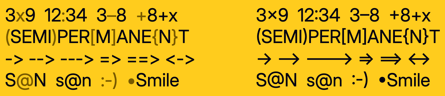
This can be used to replace -> with a proper arrow. Or to adjust the position of @ when it’s in between uppercase letters. Inter does this really well:
And you don’t even need to enable them manually, contextual alternates are enabled by default. But if you want to disable them, there is a font-variant-ligatures property:
:root {
    font-variant-ligatures: no-contextual;
}
Further reading
That’s all for today, but we have only scratched the surface. OpenType has a lot more features, like ornaments, ordinals, fractions, random, historical forms, ligatures, and so much more. If you want to go deeper into the woods, here is a nice website showcasing some of OpenType features. And check out this talk by Roel Nieskens about OpenType features. A Variable Fonts Primer is an excellent resource to learn more about variable fonts.


